
Bootstrap(부트스트랩)
Bootstrap은 강력한 프론트엔드 툴킷이다
설치
패키지 매니저로 설치하기 (아마도 설치할 일은 없을것이다. 프론트에서 사용하니까)
npm install bootstrap@5.3.3CDN(Content Delivery Network)를 이용해 포함하기
<link href="https://cdn.jsdelivr.net/npm/bootstrap@5.3.3/dist/css/bootstrap.min.css" rel="stylesheet">link태그는 head태그 내부에 넣어준다.
<script src="https://cdn.jsdelivr.net/npm/bootstrap@5.3.3/dist/js/bootstrap.bundle.min.js"></script>script태그는 </body>직전에 넣어준다.
COLOR
theme colors

color mode
v5.3.0부터 data-bs-theme속성으로 다크모드, 라이트모드 등을 사용할 수 있게 되었다. 전체 html 색깔을 적용하고싶다면
<html lang="en" data-bs-theme="dark"></html>table, dropdown에 색깔을 적용하고 싶다면
<table class="table" data-bs-theme="dark">

<div class="dropdown" data-bs-theme="dark">
를 하면 된다.
text colors
.text-muted, .text-primary, .text-success, .text-info, .text-warning, .text-danger, .text-secondary, .text-white, .text-dark, .text-body .text-light를 사용해 텍스트 색깔을 변경할 수 있다.
bagkground colors
.bg-primary, .bg-success, .bg-info, .bg-warning, .bg-danger, .bg-secondary, .bg-dark .bg-light를 사용해 배경 색깔을 변경할 수 있다.
background colors에서는 text colors까지 변경해주지 않으므로, 주의가 필요하다. background colors에 적절한 text colors를 해주는 속성은 .text-bg-{color}를 사용해야한다.
breakpoints
containers
containers는 주어진 디바이스에서 콘텐트를 정렬하는데 사용되는 근본적인 블록이다.
bootstrap container들은 크게 3가지로 나눌 수 있다.
- .container, 각 반응 브레이크포인트의 max-width로 설정한다.
- .container-{breakpoint}, 명시된 브레이크포인트까지 width:100%로 설정한다.
- .container-fluid, 모든 브레이크포인트에서 width:100%로 설정한다.
grid system
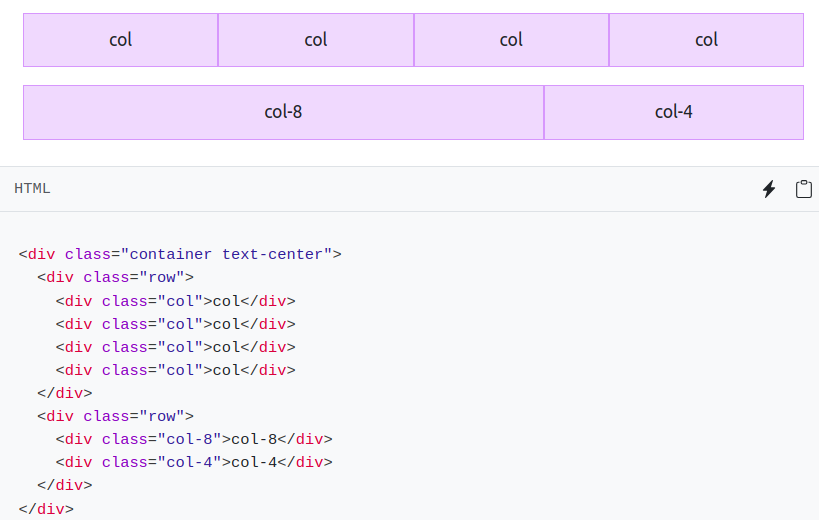
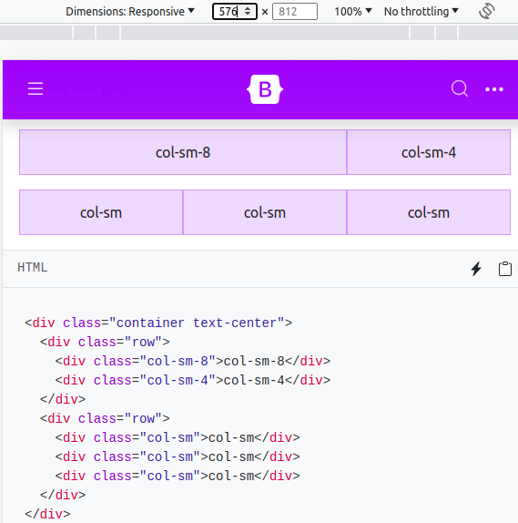
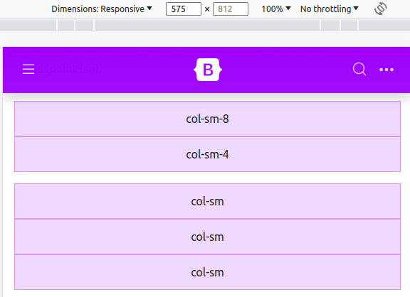
.col-{숫자} 형태로 클래스에 넣는다. 화면 가로길이에 신경쓰지 않고 개수를 유지시키려면 .col-을 사용하면 되고, 화면가로길이가 breakpoint보다 짧아질 때 div를 아래로 내리고 싶다면 .col-{sm|md|lg|xl|xxl}-{숫자}를 사용하면 된다.
bootstrap의 grid system은 containers, rows, columns를 콘텐트 레이아웃과 나란히 하는데 사용한다.
div class="col"을 div class="row"내부에 포함시켜야 정상 작동한다.
<div class="container text-center">
	<div class="row">
		<div class="col">column</div>
		<div class="col">column</div>
		<div class="col">column</div>
	</div>
</div>
col-n 형식으로 하면 row의 12칸중 n칸을 차지하게 한다.
.col-{sm|md|lg|xl|xxl}-숫자 를 하면 해당 크기의 breakpoint이하에서 가로로 같이 나타나는게 아니라, 세로로 따로따로 나타나게된다.
colums
vertical alignment
align-items-{start|center|end}로 수직 나열한다.

horizontal alignment
justify-content-{start|center|end}로 수평 나열한다.
Tables
table 태그에 .table 클래스를 추가하면 된다.
<table class="table">table, row, cell에 색깔을 부여하고싶으면 .table-{색깔} 클래스를 추가한다.

<!-- On tables -->
<table class="table-primary">...</table>
<!-- On rows -->
<tr class="table-secondary">...</tr>
<!-- On cells (`td` or `th`) -->
<td class="table-success">...</td>
table태그의 .table-striped는 행마다 줄무늬로 만든다.
<table class="table table-striped">table태그의 .table-striped-columns는 열마다 줄무늬로 만든다.
<table class="table table-striped-columns">table태그의 .table-bordered는 테이블과 세포들의 사이드에 경계를 만든다.
<table class="table table-bordered">.border-{색깔} 클래스를 같이 사용하여 색깔을 바꾼다.
<table class="table table-bordered border-primary">.table-borderless 클래스를 사용해 경계를 없앤다.
<table class="table table-borderless">Forms
label은 .form-label
input은 .form-control을 클래스로 넣는다.
<label for="exampleFormControlInput1" class="form-label">Email address</label>
<input type="email" class="form-control" id="exampleFormControlInput1" placeholder="name@example.com">
<label for="exampleFormControlTextarea1" class="form-label">Example textarea</label>
<textarea class="form-control" id="exampleFormControlTextarea1" rows="3"></textarea>
form-control의 높이를 높거나 낮게 조절하고싶으면 .form-control-lg 또는 form-control-sm을 넣는다.
<input class="form-control form-control-lg">
<input class="form-control" type="text">
<input class="form-control form-control-sm" type="text">
.form-text를 사용해 해당 form-control에 대한 설명을 추가한다.
<label for="inputPassword5" class="form-label">Password</label>
<input type="password" id="inputPassword5" class="form-control" aria-describedby="passwordHelpBlock">
<div id="passwordHelpBlock" class="form-text">
  Your password must be 8-20 characters long, contain letters and numbers, and must not contain spaces, special characters, or emoji.
</div>
파일 선택 input 예시. multiple 속성을 넣으면 여러 파일이 선택 가능하다.
<div class="mb-3">
  <label for="formFile" class="form-label">Default file input example</label>
  <input class="form-control" type="file" id="formFile">
</div>
<div class="mb-3">
  <label for="formFileMultiple" class="form-label">Multiple files input example</label>
  <input class="form-control" type="file" id="formFileMultiple" multiple>
</div>
.form-select를 사용해 select메뉴를 만든다.
<select class="form-select" aria-label="Default select example">
  <option selected>성별은?</option>
  <option value="남자">male</option>
  <option value="여자">female</option>
  <option value="무성">nonsexual</option>
</select>
.form-check로 check를 만든다.
<div class="form-check">
  <input class="form-check-input" type="checkbox" value="" id="flexCheckDefault">
  <label class="form-check-label" for="flexCheckDefault">
    Default checkbox
  </label>
</div>
<div class="form-check">
  <input class="form-check-input" type="checkbox" value="" id="flexCheckChecked" checked>
  <label class="form-check-label" for="flexCheckChecked">
    Checked checkbox
  </label>
</div>
radios만드는법.
<div class="form-check">
  <input class="form-check-input" type="radio" name="flexRadioDefault" id="flexRadioDefault1">
  <label class="form-check-label" for="flexRadioDefault1">
    Default radio
  </label>
</div>
<div class="form-check">
  <input class="form-check-input" type="radio" name="flexRadioDefault" id="flexRadioDefault2" checked>
  <label class="form-check-label" for="flexRadioDefault2">
    Default checked radio
  </label>
</div>
check의 커스텀인 switch이다
.form-check와 .form-switch를 같이 넣어준다.
<div class="form-check form-switch">
  <input class="form-check-input" type="checkbox" role="switch" id="flexSwitchCheckDefault">
  <label class="form-check-label" for="flexSwitchCheckDefault">Default switch checkbox input</label>
</div>
<div class="form-check form-switch">
  <input class="form-check-input" type="checkbox" role="switch" id="flexSwitchCheckChecked" checked>
  <label class="form-check-label" for="flexSwitchCheckChecked">Checked switch checkbox input</label>
</div>
.form-check에 .form-check-inline을 같이 넣어주면, 선택지가 좌우로 한 행에 보인다.
<div class="form-check form-check-inline">
  <input class="form-check-input" type="checkbox" id="inlineCheckbox1" value="option1">
  <label class="form-check-label" for="inlineCheckbox1">1</label>
</div>
<div class="form-check form-check-inline">
  <input class="form-check-input" type="checkbox" id="inlineCheckbox2" value="option2">
  <label class="form-check-label" for="inlineCheckbox2">2</label>
</div>
range
range는 <input type="range">에 .form-range를 한다. 최대값과 최소값은 min, max로 주고 step은 한칸에 몇씩 오르내리는지 지정할 수 있다.
<label for="customRange3" class="form-label">Example range</label>
<input type="range" class="form-range" min="0" max="5" step="0.5" id="customRange3">
floating labels
.form-floating 안에 있는 <input class="form-control"> 과 <label> elements는 유동적인 label을 보여준다.
<div class="form-floating mb-3">
  <input type="email" class="form-control" id="floatingInput" placeholder="name@example.com">
  <label for="floatingInput">Email address</label>
</div>
<div class="form-floating">
  <input type="password" class="form-control" id="floatingPassword" placeholder="Password">
  <label for="floatingPassword">Password</label>
</div>
Components
breadscrumb

현재 페이지의 위치를 계층적으로 표현할 수 있게 한다.
<nav aria-label="breadcrumb">
  <ol class="breadcrumb">
    <li class="breadcrumb-item"><a href="#">Home</a></li>
    <li class="breadcrumb-item"><a href="#">Library</a></li>
    <li class="breadcrumb-item active" aria-current="page">Data</li>
  </ol>
</nav>
buttons

.btn과 .btn-{색깔}을 사용해 기본적인 버튼을 만들 수 있다.
<button type="button" class="btn btn-primary">Primary</button>
<button type="button" class="btn btn-secondary">Secondary</button>
<button type="button" class="btn btn-success">Success</button>
<button type="button" class="btn btn-danger">Danger</button>
<button type="button" class="btn btn-warning">Warning</button>
<button type="button" class="btn btn-info">Info</button>
<button type="button" class="btn btn-light">Light</button>
<button type="button" class="btn btn-dark">Dark</button>
<button type="button" class="btn btn-link">Link</button>
.btn-lg또는 .btn-sm을 사용하면 버튼 크기를 조절할 수 있다.
<button type="button" class="btn btn-primary btn-lg">Large button</button>
<button type="button" class="btn btn-primary btn-sm">Small button</button>
button group
버튼들을 가로나 세로로 붙이고싶다면 button group화를 하면 된다.

<div class="btn-group" role="group" aria-label="Basic example">
  <button type="button" class="btn btn-primary">Left</button>
  <button type="button" class="btn btn-primary">Middle</button>
  <button type="button" class="btn btn-primary">Right</button>
</div>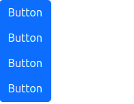
<div class="btn-group-vertical" role="group" aria-label="Vertical button group">
  <button type="button" class="btn btn-primary">Button</button>
  <button type="button" class="btn btn-primary">Button</button>
  <button type="button" class="btn btn-primary">Button</button>
  <button type="button" class="btn btn-primary">Button</button>
</div>
cards
카드는 유연하고 확장성있는 콘텐트 컨테이너이다.
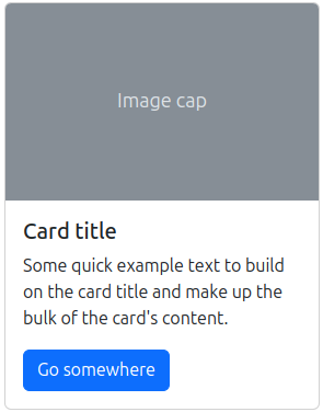
카드 안에 패딩 세션이 필요하다면 .card-body클래스를 가진 div를 사용한다.
<div class="card">
  <div class="card-body">
    This is some text within a card body.
  </div>
</div>
카드 타이틀은 <h*>태그에 .card-title클래스를 사용한다.
부제는 <h*>태그에 .card-subtitle클래스를 사용한다.
링크는 <a>태그에 .card-link클래스를 사용한다.
<div class="card" style="width: 18rem;">
  <div class="card-body">
    <h5 class="card-title">Card title</h5>
    <h6 class="card-subtitle mb-2 text-body-secondary">Card subtitle</h6>
    <p class="card-text">Some example text</p>
    <a href="#" class="card-link">Card link</a>
    <a href="#" class="card-link">Another link</a>
  </div>
</div>
이미지는 <img>태그에 .card-img-top 또는 .card-img-bottom클래스를 사용해 card-body의 위나 아래에 이미지를 넣는다.
<div class="card" style="width: 18rem;">
  <img src="..." class="card-img-top" alt="...">
  <div class="card-body">
    <p class="card-text">Some example text</p>
  </div>
  <img src="..." class="card-img-bottom" alt="...">
</div>
리스트는 .list-group클래스를 사용한다.
<div class="card" style="width: 18rem;">
  <ul class="list-group list-group-flush">
    <li class="list-group-item">An item</li>
    <li class="list-group-item">A second item</li>
    <li class="list-group-item">A third item</li>
  </ul>
</div>
header나 footer는 .card-header또는 .card-footer클래스를 사용한다.
<div class="card">
  <div class="card-header">
    header
  </div>
  <div class="card-body">
    <h5 class="card-title">Special title treatment</h5>
    <p class="card-text">some text</p>
    <a href="#" class="btn btn-primary">Go somewhere</a>
  </div>
  <div class="card-footer">
    footer
  </div>
</div>
이미지를 카드의 배경을 사용하고싶을 때는, 이미지를 <img>태그의 .card-img클래스를 사용하고, <div>태그를 .card-img-overlay클래스를 사용해 넣고싶은 내용을 넣는다.
<div class="card text-bg-dark">
  <img src="..." class="card-img" alt="...">
  <div class="card-img-overlay">
    <h5 class="card-title">Card title</h5>
    <p class="card-text">This is a wider card with supporting text below as a natural lead-in to additional content. This content is a little bit longer.</p>
    <p class="card-text"><small>Last updated 3 mins ago</small></p>
  </div>
</div>
collapse
콘텐트의 시각성을 토글하는 기능이다.

<button>태그에 data-bs-toggle="collapse" 속성을 추가하고, data-bs-target="" 속성에 #id또는 .class를 추가하고, aria-controls=""속성에 id를 추가하고, aria-expanded="false"속성을 추가한다(기본적으로 보일거면 true).
<button class="btn btn-primary" type="button" data-bs-toggle="collapse"
	data-bs-target="#collapseExample" aria-expanded="false" aria-controls="collapseExample">
	Button with data-bs-target
</button>

<div class="collapse" id="collapseExample">
	<div class="card card-body">
		Some placeholder content for the collapse component. This panel is hidden by default but
		revealed when the user activates the relevant trigger.
	</div>
</div>
dropdowns
링크들의 리스트를 토글하는 기능이다.

<div class="dropdown">
  <button class="btn btn-secondary dropdown-toggle" type="button" data-bs-toggle="dropdown" aria-expanded="false">
    Dropdown button
  </button>
  <ul class="dropdown-menu">
    <li><a class="dropdown-item" href="#">Action</a></li>
    <li><a class="dropdown-item" href="#">Another action</a></li>
    <li><a class="dropdown-item" href="#">Something else here</a></li>
  </ul>
</div>
offcanvas
숨겨진 사이드바를 만드는 기능이다.
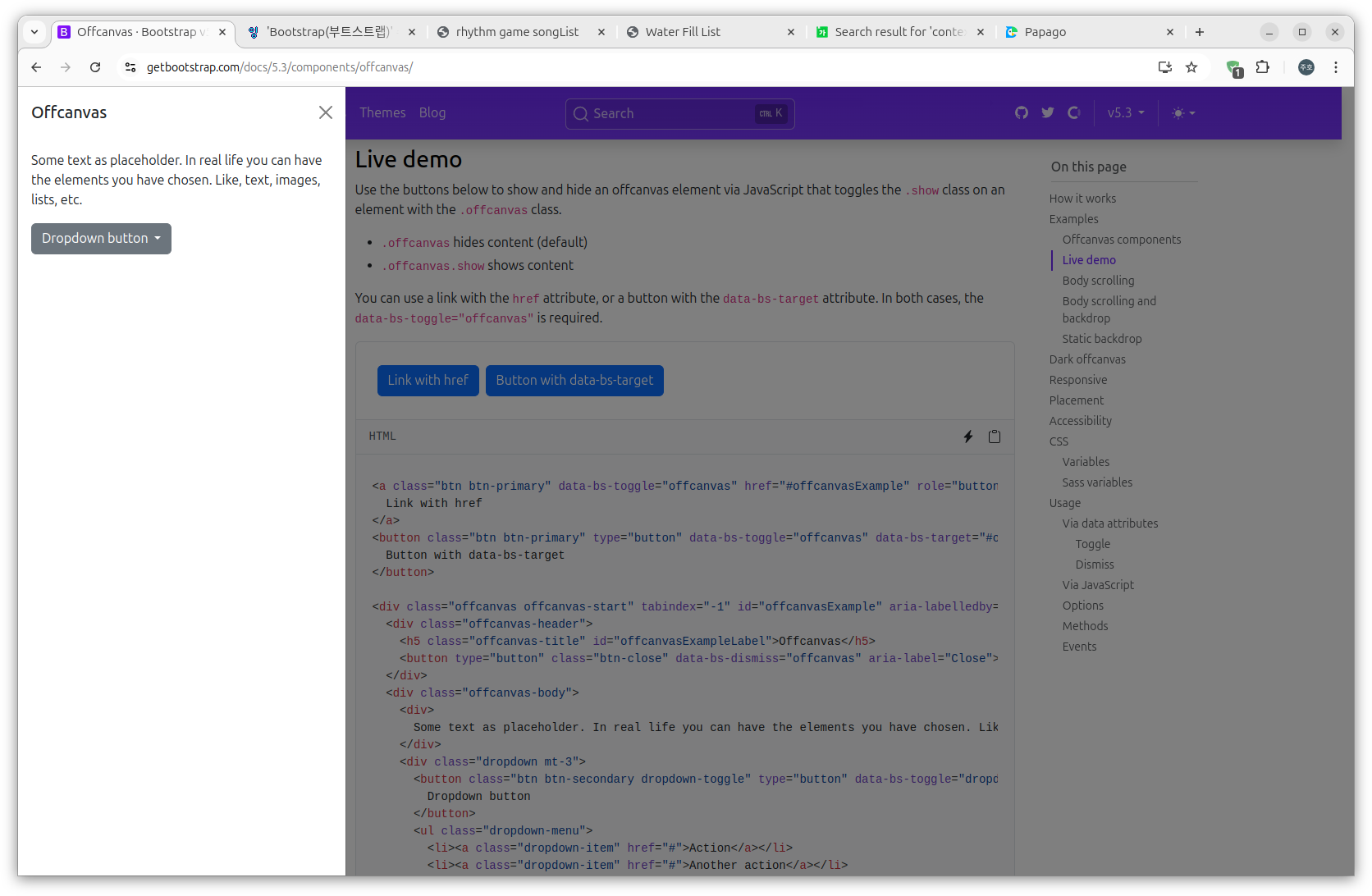
<button>태그에 data-bs-toggle="offcanvas"속성을 추가하고 data-bs-target=""에 #id를 넣어 속성을 추가하고 aria-controls=""속성에 id를 넣어서 버튼을 만든다.
<div>태그에 .offcanvas를 넣고, 왼쪽은 .offcanvas-start 오른쪽은 .offcanvas-end 위는 .offcanvas-top 아래는 .offcanvas-bottom 클래스를 넣는다. tabindex="-1"속성도 추가한다.
<a class="btn btn-primary" data-bs-toggle="offcanvas" href="#offcanvasExample" role="button" aria-controls="offcanvasExample">
  Link with href
</a>
<button class="btn btn-primary" type="button" data-bs-toggle="offcanvas" data-bs-target="#offcanvasExample" aria-controls="offcanvasExample">
  Button with data-bs-target
</button>

<div class="offcanvas offcanvas-start" tabindex="-1" id="offcanvasExample" aria-labelledby="offcanvasExampleLabel">
  <div class="offcanvas-header">
    <h5 class="offcanvas-title" id="offcanvasExampleLabel">Offcanvas</h5>
    <button type="button" class="btn-close" data-bs-dismiss="offcanvas" aria-label="Close"></button>
  </div>
  <div class="offcanvas-body">
    <div>
      Some text as placeholder. In real life you can have the elements you have chosen. Like, text, images, lists, etc.
    </div>
    <div class="dropdown mt-3">
      <button class="btn btn-secondary dropdown-toggle" type="button" data-bs-toggle="dropdown">
        Dropdown button
      </button>
      <ul class="dropdown-menu">
        <li><a class="dropdown-item" href="#">Action</a></li>
        <li><a class="dropdown-item" href="#">Another action</a></li>
        <li><a class="dropdown-item" href="#">Something else here</a></li>
      </ul>
    </div>
  </div>
</div>
navbar
네비게이션 바 기능이다.

<nav>태그에 .navbar와 .navbar-expand{-sm|-md|-lg|-xl|-xxl} 클래스를 추가한다.
.justify-content{-start|-end|-center|-between|-around|-evenly}로 어떤 배치를 할것인지 정한다.
.navbar-brand를 사용해 프로젝트 이름을 표현한다.
<span>태그에 .navbar-text를 사용해 텍스트를 표현한다.
.navbar-nav를 사용해 리스트나 <a>같은것들을 가로로 놓게 한다.
progress
진행 바 기능이다.

기본적으로 .progress와 role="progressbar"를 넣고, 하위 div에 .progress-bar와 style로 width를 지정해준다. 라벨은 하위 div에 넣으면 된다.
<div class="progress" role="progressbar" >
  <div class="progress-bar" style="width: 40%">라벨</div>
</div>
색깔을 변경하려면 하위 div에 .text-bg-{info|success|warning|danger}등을 적용한다.

줄무늬를 입히려면 .progress-bar-striped를 하위 div에 적용한다.
움직이는 줄무늬를 입히려면 추가로 .progress-bar-animated를 하위 div에 적용한다.
modal
유저 알림인 모달 기능이다.

button을 만들어 data-bs-toggle="modal"속성을 부여하고 data-bs-target="#id" 속성을 부여한다.
<div>태그에 .modal을 넣고, 위에서 아래로 자연스럽게 애니메이션 하고싶다면 .fade도 넣는다.
.modal-dialog, .modal-content를 클래스로 가지는 div태그를 자식으로 넣어주고, .modal-content의 자식으로 .modal-header, .modal-body, .modal-footer를 클래스로 가지는 div들을 만들어주면 된다.
<!-- Button to Open the Modal -->
<button type="button" class="btn btn-primary" data-bs-toggle="modal" data-bs-target="#myModal">
    Open modal
</button>
<!-- The Modal -->
<div class="modal fade" id="myModal">
    <div class="modal-dialog">
        <div class="modal-content">
            <!-- Modal Header -->
            <div class="modal-header">
                <h4 class="modal-title">Modal Heading</h4>
                <button type="button" class="btn-close" data-bs-dismiss="modal"></button>
            </div>
            <!-- Modal body -->
            <div class="modal-body">
                Modal body..
            </div>
            <!-- Modal footer -->
            <div class="modal-footer">
                <button type="button" class="btn btn-danger" data-bs-dismiss="modal">Close</button>
            </div>
        </div>
    </div>
</div>
Utilities
spacing
m - margin을 의미
p - padding을 의미
t - margin-top 또는 padding-top을 의미
b - margin-bottom 또는 padding-bottom을 의미
s - margin-left 또는 padding-left를 의미
e - margin-right 또는 padding-right를 의미
x - *-left와 *-right 둘다 포함
y - *-top과 *-bottom 둘다 포함
0~5 (숫자) - $spacer 의 .25 .5 1 1.5 3을 의미
auto - margin을 auto로 할때 사용
예시
<div class="mt-0"></div>
<div class="m-0 p-0"></div>
<div class="mx-auto p-3"></div>
icons
아이콘을 사용하려면 추가적으로 stylesheet를 가져와야한다.
CDN:
<link rel="stylesheet" href="https://cdn.jsdelivr.net/npm/bootstrap-icons@1.11.3/font/bootstrap-icons.min.css">사용법: <i class=""></i>에 적당한 클래스를 삽입한다.
<i class="bi-alarm"></i>아이콘 리스트: https://icons.getbootstrap.com/
https://www.w3schools.com/bootstrap5/index.php
-